|
| Category: Complete SetsGlassUI |
| Interface Information |
|
| Name: |
GlassUI  |
| Author: |
|
| Date: |
03-29-2007 04:16 PM |
| Size: |
8.45 MB |
| Version: |
1.91 |
| Rate Addon: |
 |
|
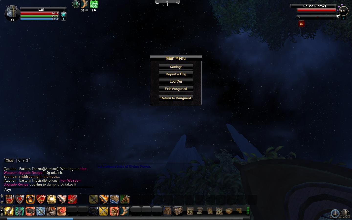
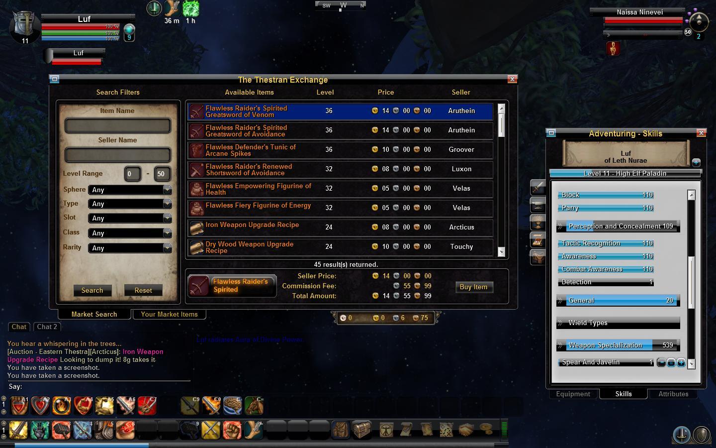
GlassUI (v1.9)
Tired of an ugly cluttered interface? Minimize the crap with GlassUI's sleek and sexy transparent features. Utilizing the default Vanguard UI, GlassUI is able to withstand patches and fixes that corrupt other interfaces regularly.
Comments and suggestions appreciated.
|
| Archive List (Old Versions) |
File Name |
Version |
Size |
Author |
Date |
|
1.9 |
8.45 MB |
kegz |
03-19-2007 05:01 PM |
|
1.3 |
6.69 MB |
kegz |
02-20-2007 10:59 PM |
|
1.3 |
6.69 MB |
kegz |
02-20-2007 10:59 PM |
|
1.3 |
6.69 MB |
kegz |
02-20-2007 10:59 PM |
|
1.3 |
6.69 MB |
kegz |
02-20-2007 10:59 PM |
|
1.3 |
6.69 MB |
kegz |
02-20-2007 10:59 PM |
|
1.3 |
6.69 MB |
kegz |
02-20-2007 10:59 PM |
|
1.2 |
9.01 MB |
kegz |
02-18-2007 04:46 PM |
|
1.1 |
9.11 MB |
kegz |
02-17-2007 09:13 PM |
| File Statistics |
| User Rating: |
|
| Downloads: |
7859 |
| Views: |
27096 |
| Favorites: |
8 |
| Uploaded By: |
|
| Last Modified: |
N/A |
|
|  |
|
 |
|
 06-15-2007, 03:44 PM
|
|
Junior Member
Forum posts: 0
File comments: 1
Uploads: 0
|
Thank you for your time and effort to make this and your willingness to provide it to the public. A vast improvement over the default. I have only had two minor problems with it.
The xp bar seems to be the same size as the default, with transparent areas on the ends. I place it on the lower left of the screen and every time I log in it is displaced to the right. It isn't a big deal and probably not worth the risk of having things break every patch if that's a factor.
It appears that the diplomacy equipment background in the character window uses the adventure equipment background, things equip in the wrong slots and some slots aren't visible. Also not a big deal /wear <whatever> works fine.
Thanks again, nice work.
|


|


|
|
06-14-2007, 01:08 PM
|
|
Junior Member
Forum posts: 2
File comments: 1
Uploads: 0
|
Character selection.
Hey. I just installed your UI and now when i login i keep missing character selection menu. Then when i change the Default UI back it works. But not with GlassUI.  Whats wrong? |
|
|
|
|
03-13-2007, 02:04 PM
|
|
Junior Member
Forum posts: 0
File comments: 2
Uploads: 0
|
great UI though I have noticed 1 problem so far, when in the attributes button page there seems to be a delay required between attribute points both + and -
|
|
|
|
|
03-10-2007, 09:16 PM
|
|
Junior Member
Forum posts: 0
File comments: 1
Uploads: 0
|
~
I'm loving this UI so far, it's simply awesome. I do have one request, I was wondering if you could please include an option to toggle the display of (party member(s) & self) class avatars. It would clear up quite a decent amount of UI space for those who chose to do so.
Thanks very much for any consideration to my request  |
|
|
|
|
02-23-2007, 05:31 AM
|
|
Junior Member
Forum posts: 0
File comments: 1
Uploads: 0
|
Could you add a large % to the pet hp bar? (or to a reworked pet window)
Either would be great.
|
|
|
|
|
02-21-2007, 11:14 PM
|
|
Junior Member
Forum posts: 17
File comments: 2
Uploads: 1
|
working on all 3
compass already fixed
|
|
|
|
|
02-21-2007, 10:00 AM
|
|
Member
Forum posts: 71
File comments: 4
Uploads: 0
|
I too am a minimalist however this is a nice interface.
a few notes
1. the names in the social window for guild, friends and searching are in black and therefore become almost unreadable with the dark translucent background.
2. As Oakayam stated previously the compass does need work, slightly taller and slightly longer would be good, with yellow or maybe a light blue lettering to contrast the dark.
3. XP percentile would be nice.
|
|
|
|
|
02-19-2007, 06:37 AM
|
|
Member
Forum posts: 52
File comments: 1
Uploads: 0
|
Looks pretty good ^^ I'll give it a try.
Personally, as minimalist i would get rid of main hotbar, menu hotbar and bag hotbar backrounds so they mach secondary hotbars. Just an opinion anyway ^^.
Thanks
----------------------------------------------------------------------------------------------------------
Edit:
Ok, now that actually seen in the game I'm quite impressed. Hotbar backrounds look better then i thought. I dont use the default layout and stack the hotbars togather on one side of the screen. While i prefer no backrounds, yours look quite good.
I think compass could use a little more work though. Letters tend to stick out of the compass graphic foreground. Farthermore, directions like NE, SE, SW, NW are hard to read ( I know its rather intuitional ; i'm being picky :P ). Also i did prefer my heading mark for lacation with default UI because it was better visable in red. Though i think red maybe be too dark for your UI, I'd prefer something other then silver.
Last edited by Oakayam : 02-19-2007 at 03:31 PM.
|
|
|
|
|
|
All times are GMT -5. The time now is 08:37 PM.
|
|